[ Micro typography ]
“… Words from UPPER CASE we actually have to spell; But we capture words from lower case letters in context, as word images …”
Jan Tschichold, from: “Pleasing printed matter through good typography” [Erfreuliche Drucksachen durch gute Typographie]. Otto Maier Verlag, Ravensburg, 1960
Every word and its dependent characters contain details that need to be designed for readability.
Micro typography in its aim challenges me as a book designer to recognize the relationships between the individual characters and the characters arranged in words and lines, to use their rhythmic context and to observe the effect in the macro typographical design – that the thoughts of “font characters” simultaneously, clearly and for joy are spread out beautifully and permanently. »» more »
- ⅷ -
Macro typography
The macro typography implements the typographical design of all primary elements and aims at the overall visible impression of the publication. The practice dictates the different effort for tasks and assignment fields; they are dependent on the medium to be designed and the target reader group to be reached.
With the macro typography, the textual appearance of the publication is designed taking into account graphic elements – supplemented with images, illustrations, reproductions, diagrams, formulas, etc.
As a result, my concept as a designer is visible …
Examples of micro typography (see below):
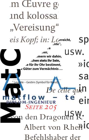
- Example 1: Collage of microtypographic details.
- Example 2: Micro typography with uppercase eszett (ß).
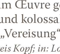
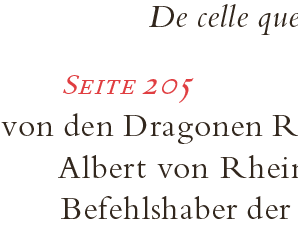
- Examples 3 – 5: Microtypographic details.
- ⅸ -

- Example 1: Collage of microtypographic details.

- Example 2: Micro typography with uppercase eszett (ß).

- Example 3: Microtypographic details.

- Example 4: Microtypographic details.

- Example 5: Microtypographic details.


